The Gratitude Mirror
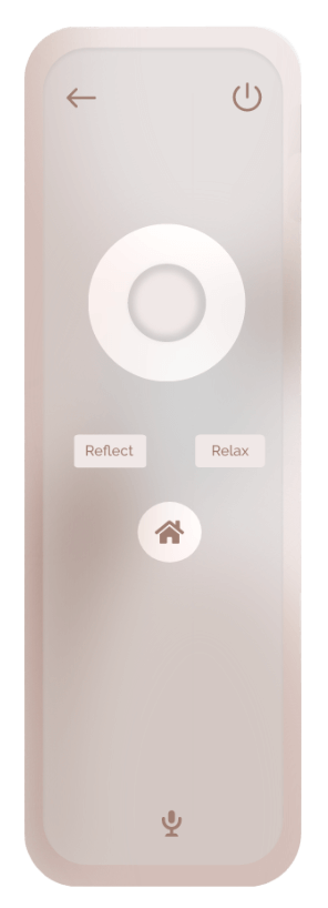
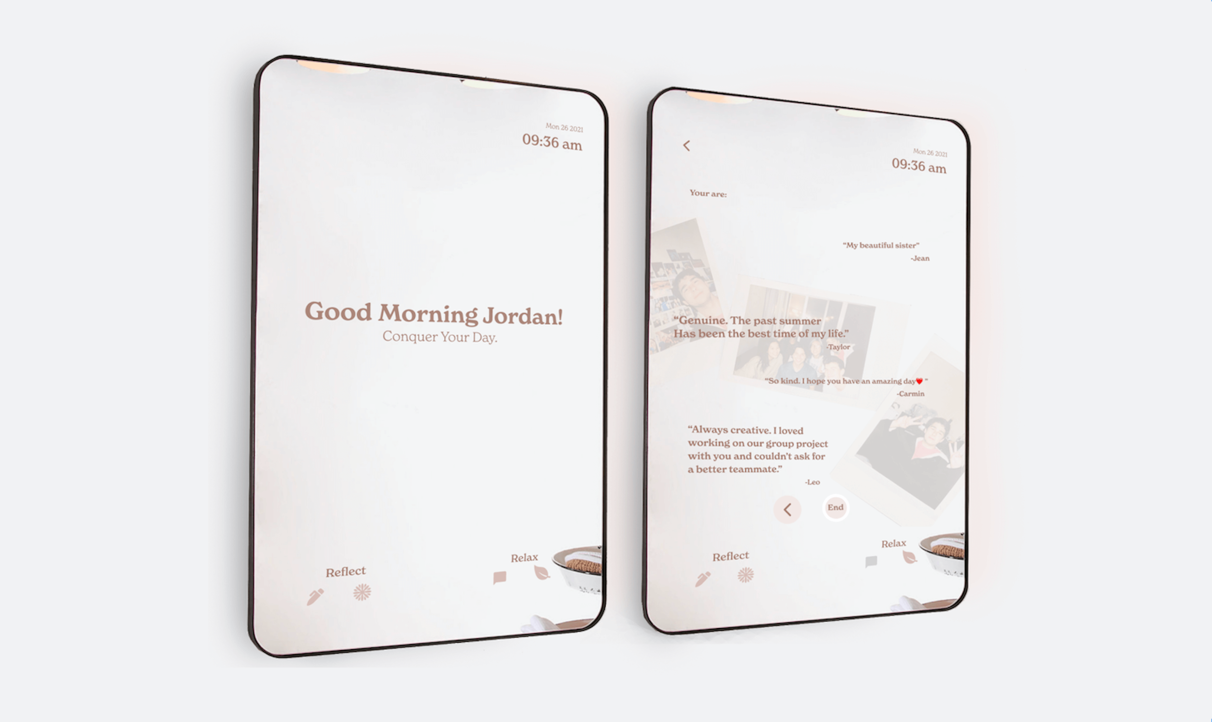
In a challenge to create a product that promotes gratitude within daily life, my team and I designed The Gratitude Smart Mirror. This was a project where I brought a concept to life from zero to one.
the team
Christine Pak
Miffy Tani
Sanya Verma
Jessica Nabi
timeframe
September 2021
December 2021
skills
product design
ux research
adobe xd
branding
my role
Supported all phases of research and design. Played large role in concept ideation & branding.
Here is a peek of our Final Mirror featuring our key design features:
Environment
A room transformation. Take yourself out of your room and enter any environment you desire.
Affirmations
A guided read aloud to promote daily positive affirmations. After they are read, you are rewarded with a community feature where you can read your friends' affirmations.
Journaling
A verbal speech-to-text journaling experience where you can save daily entries. This feature utilizes the remote as a microphone.
Focus
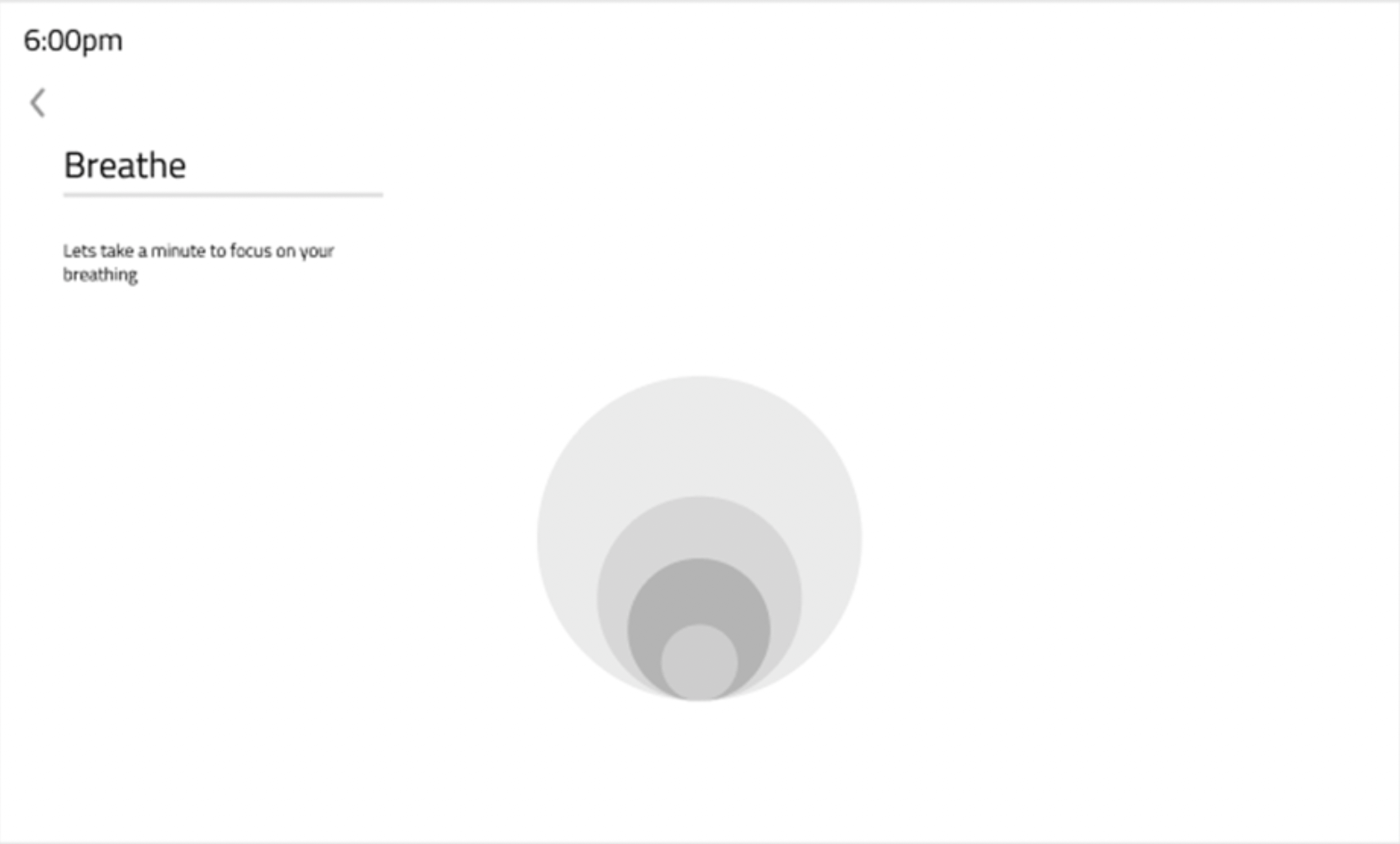
A guided breathing exercise using micro-animations to help bring attention to yourself.
Back to the Beginning of our Process
When thinking about what kind of product we wanted to create, my team and I went in only with the idea that what we were designing MUST involve some sort of expansion of self-gratitude in a strict, daily manner. With only this in mind, we began to ask others their view on the concept of gratitude and if they were already doing something like this in their routines.

These are the questions we asked our participants:
- How often do you take the time to reflect on your day/month/year?
- What do you do when you’re feeling down? Who do you go to?
- What do you think of when you look in the mirror?
- What makes you grateful?
- How often do you privately express your thoughts?
- Can you tell me about a time you’ve had a bad day and what you do in response?
We overall had very productive and insightful conversations that greatly supported the beginning of our design journey.
We realized that practicing gratitude everyday is something that is very difficult and is an act that is rarely done as a daily routine. We saw that through these initial conversations, community, verbal expression, time and convenience could encourage some routine of self-care.
And thus this established our problem…
How can we make expressing gratitude easier and more intuitive to do everyday, and in what way can we manifest this to encourage others to keep it up as a genuine routine? One thing that stuck out to us during our needs assessment interviews was this quote:
“Looking at a mirror is confronting and powerful.”
Inspired by this, we made the interface of our product a digital mirror.
Competitive Analysis
We went deeper into our product research with a comprehensive competitive analysis. In order to better understand what makes a platform easily engaging on a daily basis, we examined different social media applications.
Snapchat has mastered the art of everyday habit through their ‘streaks’ feature. They have successfully gamified existing parts of their platform to draw in users on a daily basis. When we tried to understand how, we discovered that the act of interacting with other peers through the application (community) was the main factor.
Headspace utilizes guided daily meditation to support users’ mental health. How can this routine of self-reflection and daily relaxation be done even easier in a shorter amount of time?
Although there are many mirror products such as Mirror.co that provide home gyms, how can we use similar interactions for mental practices?
Many self reflection apps such as Day One and Headspace hyper focus on one aspect of mental health. How can we most effectively combine these features to create the most efficient self care routine product?
Who are we creating for?
When determining our customer base, we decided to target young women. Especially with the issues surrounding the self-confidence of women in this day and age, we wanted to take what the mirror currently represents to young women, insecurity and scrutiny, to a place where they can safely express themselves. Instead of feeling self-judgment when looking into a mirror, we want it to transform it into a daily reminder of self-gratitude.


Taylor, 19, Student
“I constantly feel overwhelmed by my new college environment, and I want to be able to take a break from the stressful cycle of school and get better at having a self-care routine”
Shannon, 30, Mother
“Between going to work and starting my journey of becoming a mother, I want an easier way to routinely take care of myself.”
The adjectives to describe our audience are:

Reflecting or Relaxing?
We decided to organize our features under two groups, ‘Reflect’ and ‘Relax’ so our users gain a sense of control over their routine.
In order to enforce a consistent enjoyable routine, people need the option to take a break from deep reflection. Under the ‘Relax’ features, we offer a visual experience where users are rewarded with comments from their friends/family/community. The Environment feature also offers a visual experience where they can immerse themselves in a different ambiance.
Establishing The Flow
With the guidance of our main features, we created our user flow.
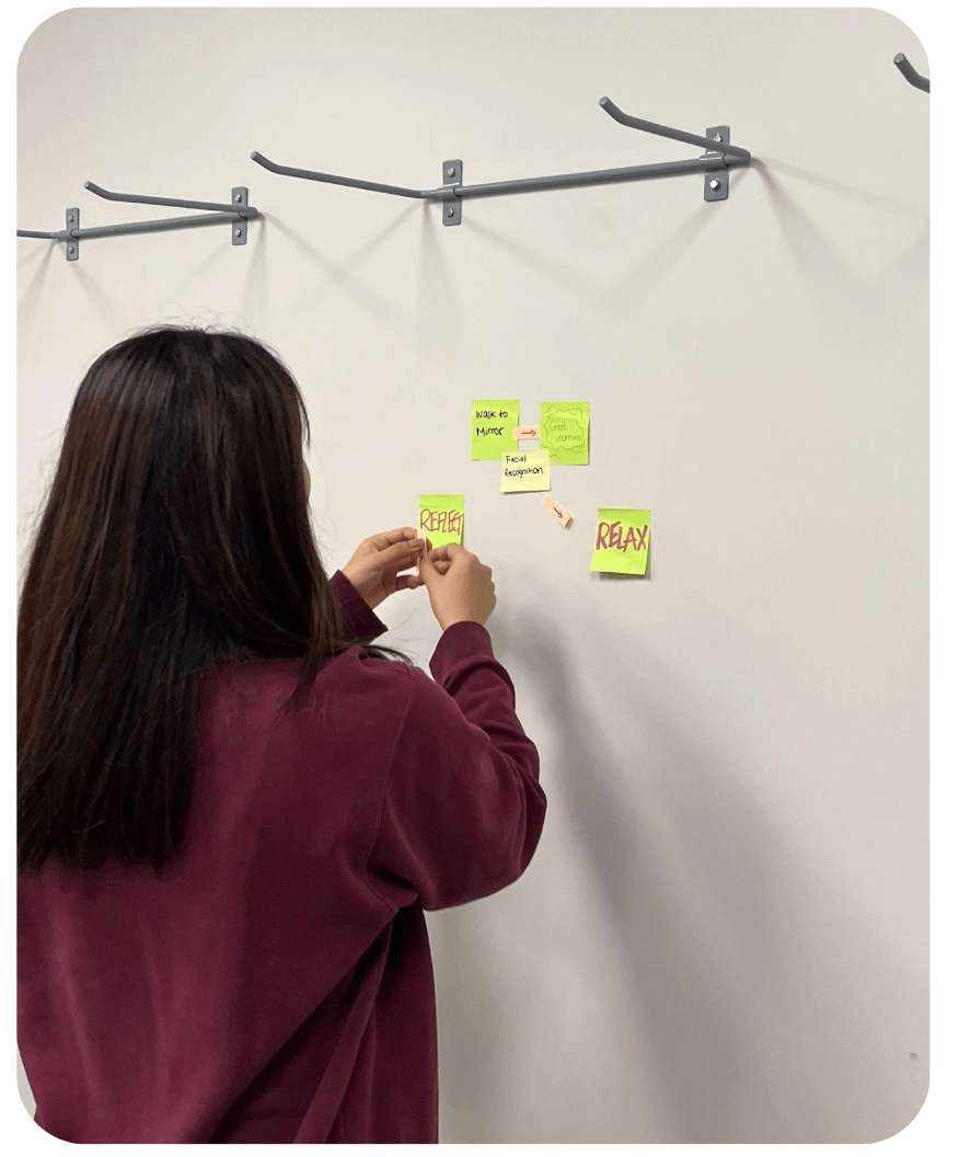
And after establishing these two groups, we defined our key features within them:

Journaling
A verbal speech-to-text journaling experience where you can save daily entries. This feature utilizes the remote as a microphone.
Focus
A guided breathing exercise using micro-animations to help bring attention to yourself.

Environment
A room transformation. Take yourself out of your room and enter any environment you desire.
Affirmations
A guided read aloud to promote daily positive affirmations. After they are read, you are rewarded with a community feature where you can read your friends' affirmations.
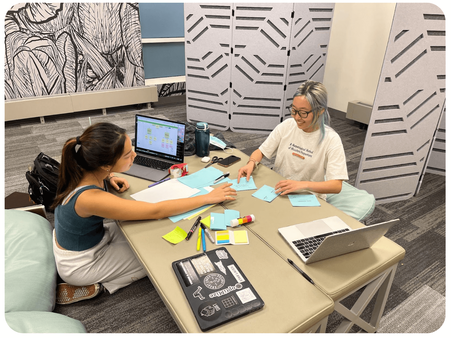
With these ideas, we did our first iteration of design consisting of a paper prototype and an intial round of user testing.
Depicting our interface on paper allowed us to quickly iterate through various ideas multiple times. It was also the shortest and most efficient method of making adjustments and improvements to our product. This gave us the opportunity to see user’s interact with our mirror’s flow and help us better understand user habits.

Paper Prototype User Test Findings
- Organization of features under either ‘reflect’ or ‘relax’ are cluttered
- Feature icons were not clearly identified
- Photo gallery shouldn’t be its own feature
- Remote buttons needs to be simplified
The Remote
In addition to this, we also got feedback from this stage to include an additional controller. We thought this would greatly increase the accessibility of our product, so we included a physical remote alongside our mirror. Through this, the user can have the option to select features and navigate the interface within a few clicks instead of always having to touch the mirror’s surface.
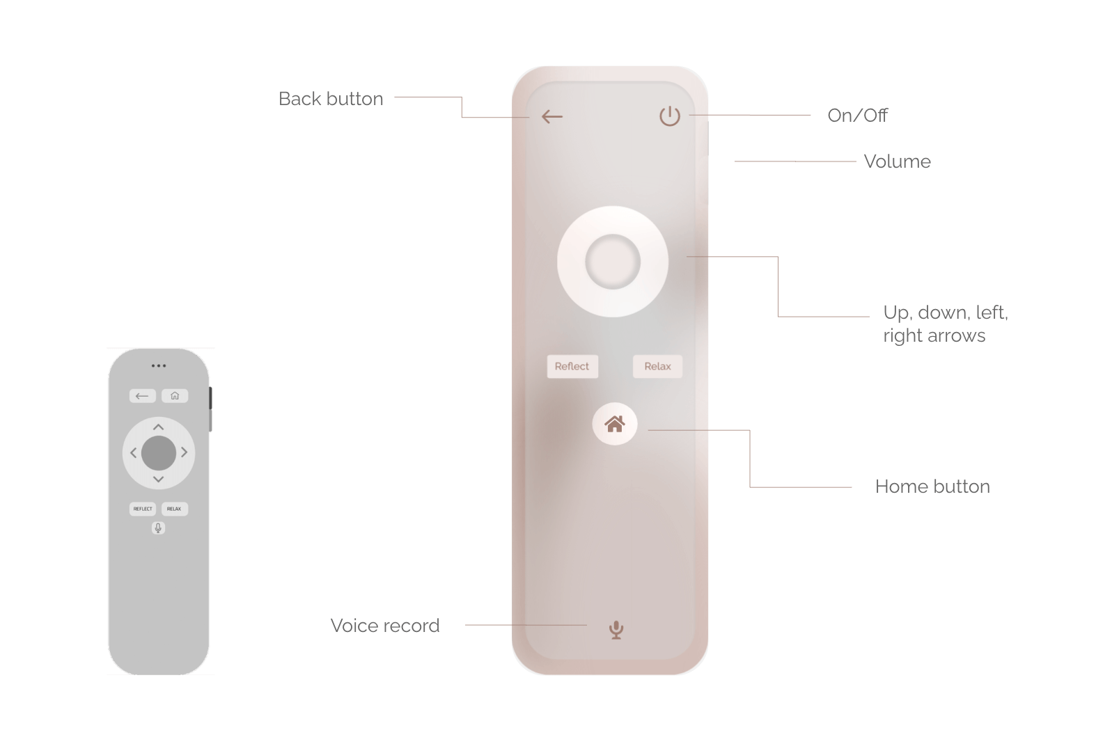
After our rounds of hand sketching, we continued digitally with wireframing and eventually mid fidelity prototyping:
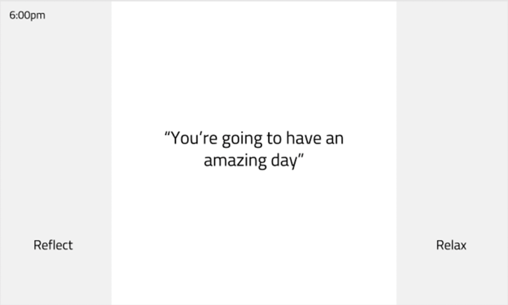
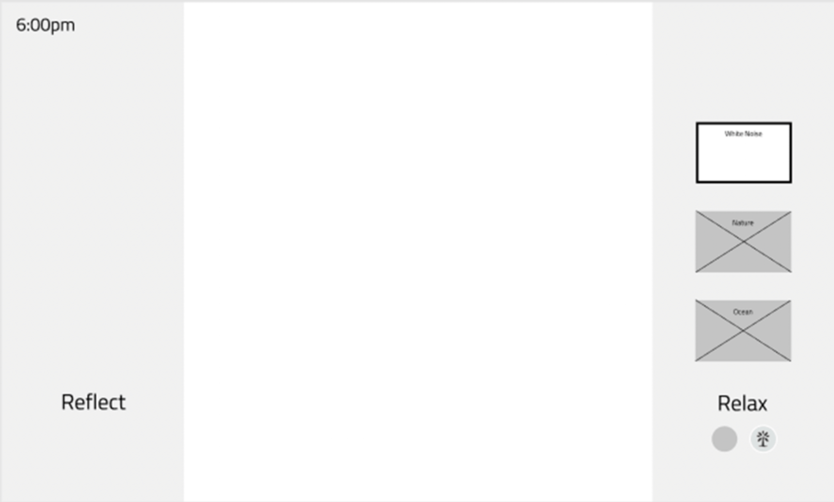
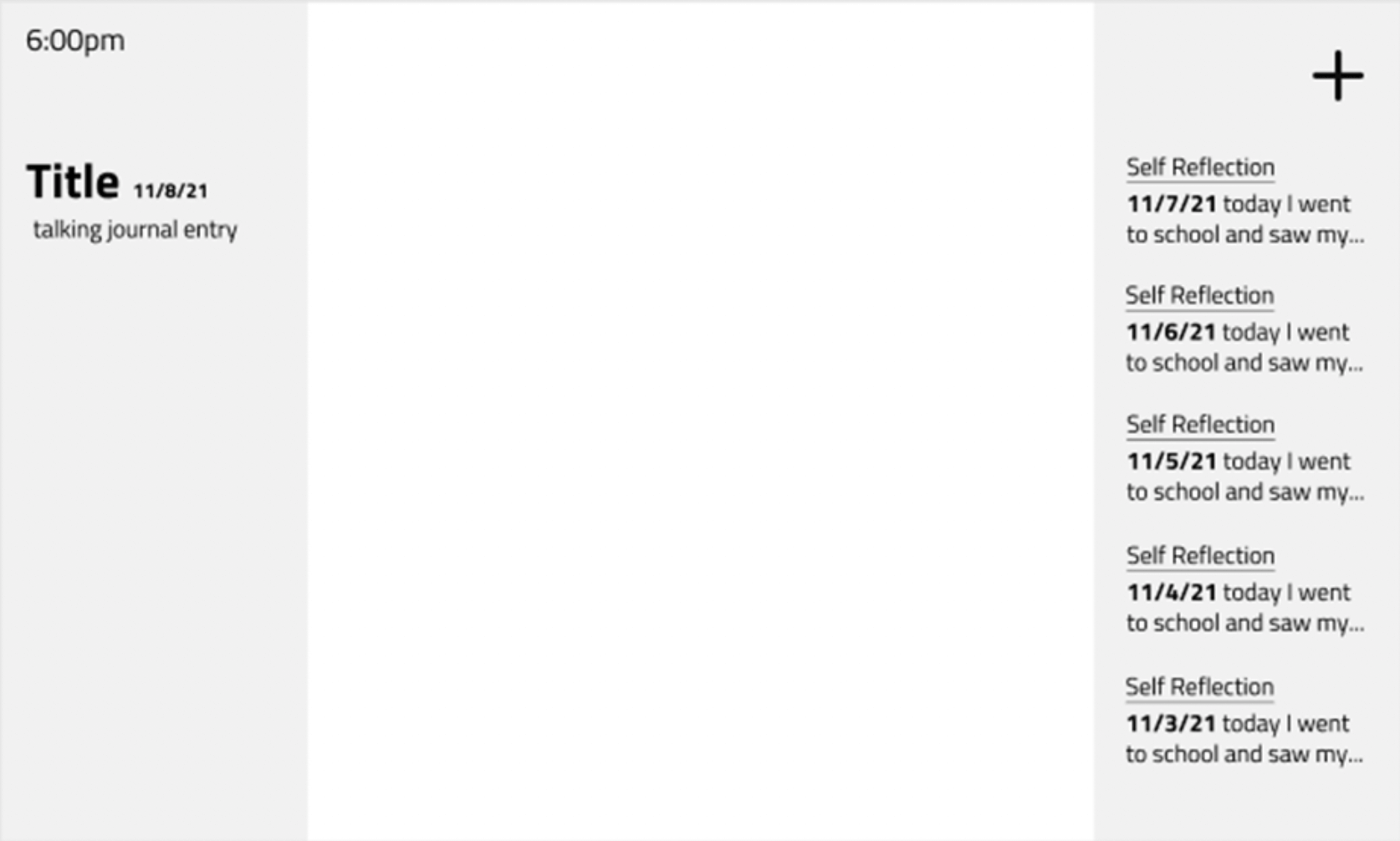
And to prepare for our high fidelity prototype, we established our style guide:
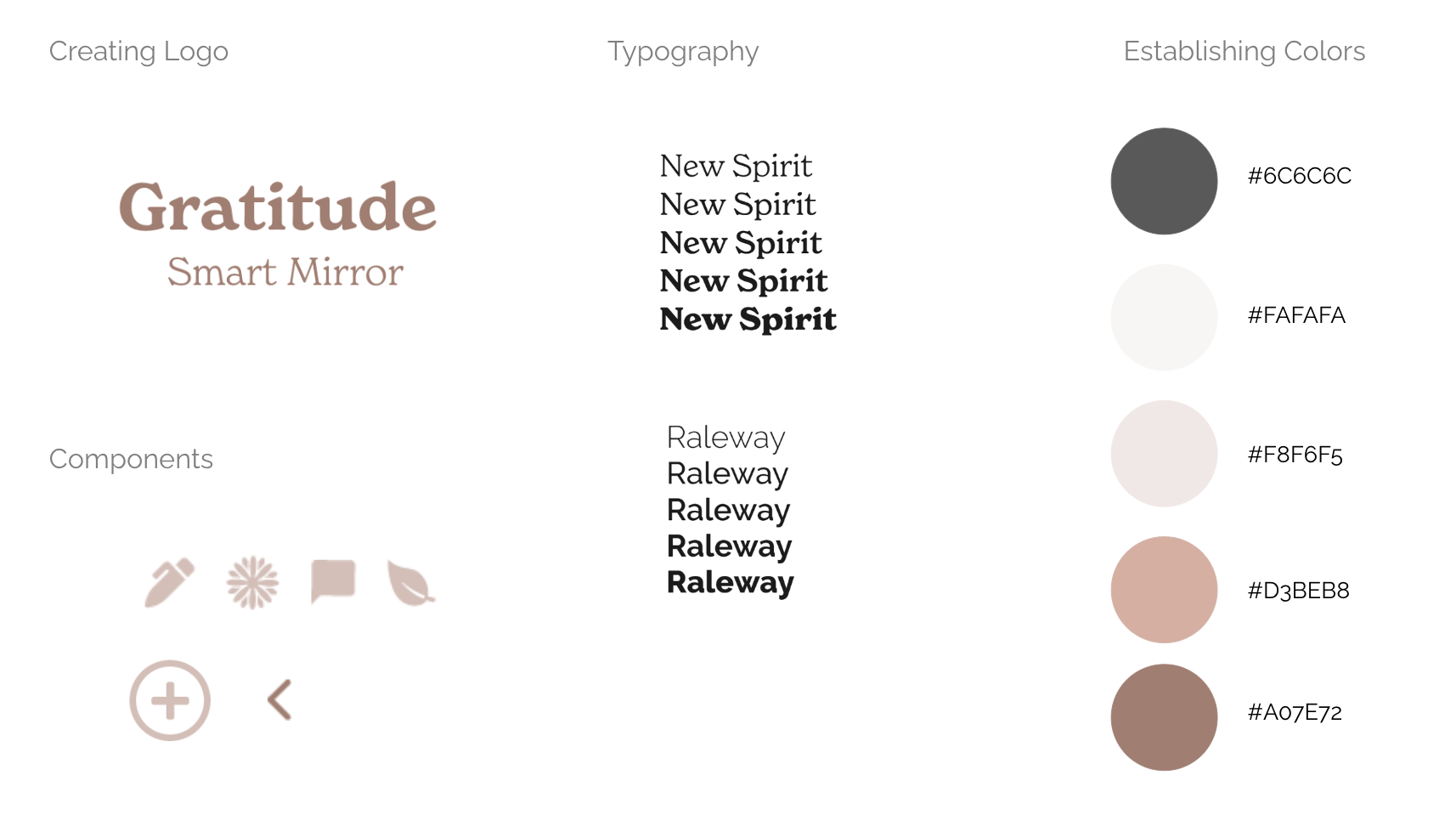
Establishing a tone and voice to our product will help us better understand the design direction. Our main goals with our style were to stay clear, concise, and to establish an empowering tone encouraging personal growth.
Final Reflection
This project was extremely different from my other digital projects in a sense that it used a unique platform of a physical mirror. It was a new experience to figure out how to most effectively prototype and visually show a physical product on a digital interface. This project also pushed my group and I to think about branding as well as the usability of the product. How can we make something beautiful, useful, and market it at the same time? It was rewarding to see our concept of self gratitude come to life, something that I feel every individual needs more of.
