

The Smithsonian Institution
overview
A redesign of the Smithsonian Institution's 3D and augmented reality desktop platform, the Voyager. My team and I increased the accessibility of its features, resulting in an easier learning experience when interacting with the Smithsonian's expansive library of historical artifacts.
the team
Christine Pak
Lexi Fogel
Ben Decker
Arjan Guglani
timeline
September 2022
May 2023
tools
Figma
UserTesting.com
my role
Conducted / created user tests. Led large portion of the visual design & prototyping phase.
The Problem and Our Audience
In order to set our overarching goals for the project, my team and I met with our client to discuss the current issues they saw with the Voyager. After sharing their thoughts on what needed improvement, we constructed this problem statement to guide our ambition throughout the entire project:
Many users are not utilizing the Smithsonian Voyager application to its full potential. The platform does not efficiently support a self-directed learning experience due to the complexity of the interface and its tools. The application is created to promote learning, and the confusion that arises with using its features greatly diminishes the platform's goal.
We then deliberately outlined the audience group we would focus on for the majority of our research and design phases. While our client wanted their primary persona to be the ‘general public’, we as a team felt that this scope was too large for the project and committed to design for educators, students, and life-long learners, and 3D enthusiasts. In order to serve the larger public, we also made sure to consider the platform’s accessibility for those hard of hearing or sight.
Educators
Students

Life-long Learners
3D Enthusiasts
The design challenges I solved:
problem #1
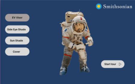
Underutilization of the Tour Feature
The Tour feature shows great potential, particularly within the realm of education. However, it currently grapples with usability issues that hinder users from full engagement. Upon initiating the Tour, users often find themselves overwhelmed by an abundance of information, preventing them from absorbing the wealth of content this feature has to offer. Consequently, many users tend to disengage before fully benefiting from the extensive educational experience that the Tours feature provides.
solution #1
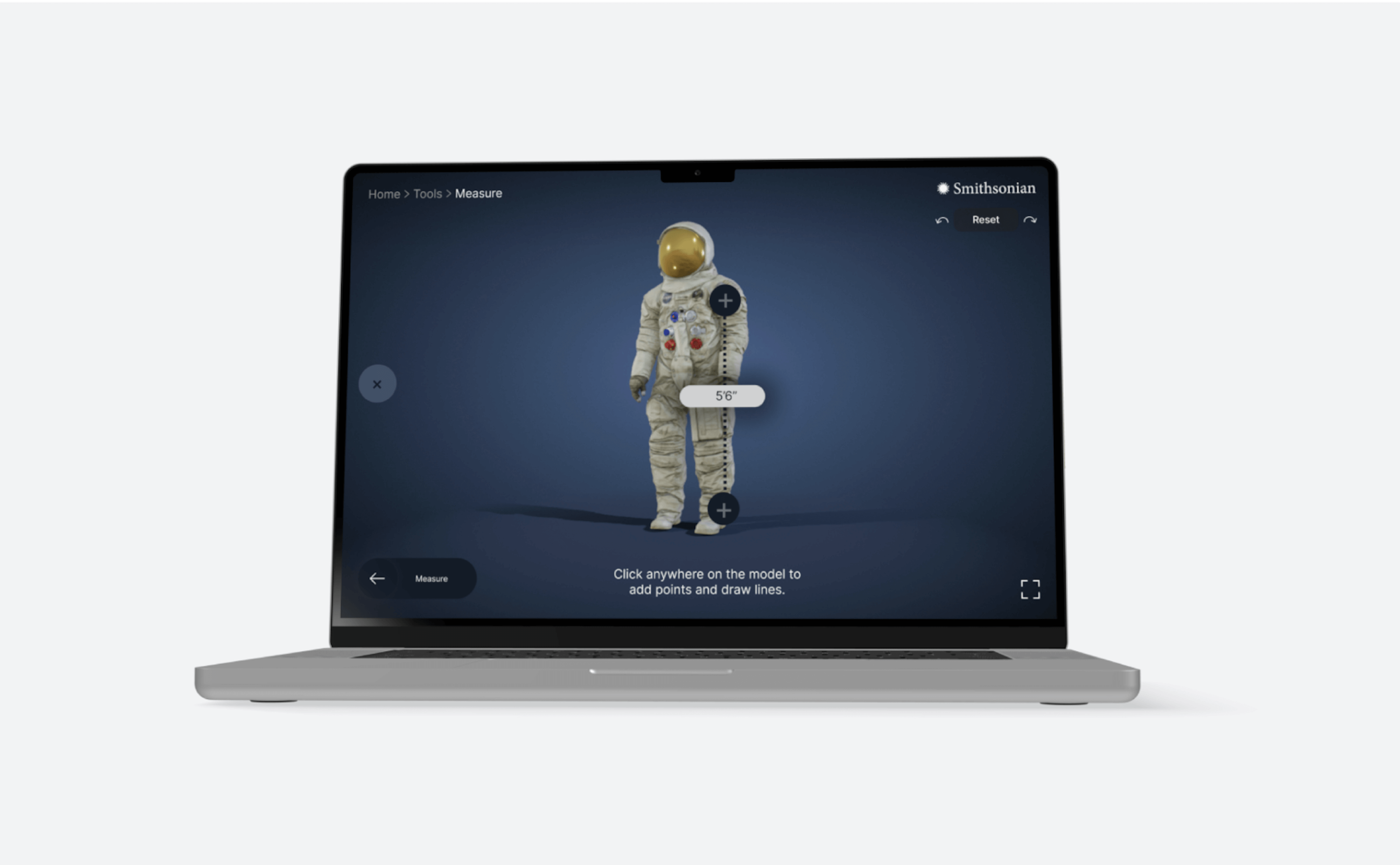
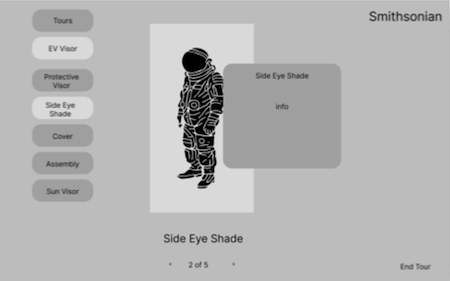
The Redesigned Tour Module
In our final prototype, we helped users connect the information they were presented with by adding numbers to each Tour step that correlates with the referenced object. We also increased the touch targets of the back and forward button, giving full visibility of the user's autonomy when going through the Tour. We produced an interface that makes the Tour content pop front and center as well as easy to control and use.
problem #2
Insufficient user guidance
The absence of clear user guidance is the overarching concern that contributes to the underutilization of Tours. Key components like tab menus and certain customization options lack adequate descriptions, leaving many users to resort to trial and error for familiarization. Consequently, some of the more intricate, yet insightful features remain underutilized, as there is either no documentation or insufficient guidance available to instruct users on how to use them effectively.
solution #2
Enhanced Guided Experience
In direct response from our iterative user testing, we added verbal descriptions to any features that required specific actions. While some tools and features of the Voyager are made to be 'intuitive', it was clear through our research that most were not. Instead of adding a large how-to or information section onto the platform, we decided to guide users throughout the tools and features that they encounter through brief, directive captions.
problem #3
Features and Tool Clutter
Due to the way tools and features were presented, many study participants found it very frustrating to effectively use them. Thus, having these extremely unique and immersive action items added system complexity with very little output value.
solution #3
Reorganized Navigation
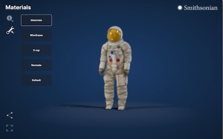
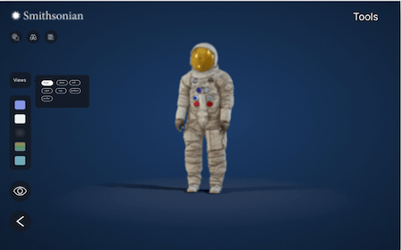
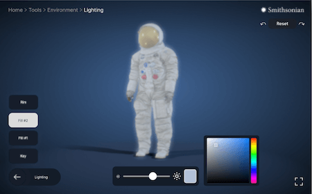
We made the features and tools on the Voyager more descriptive with thorough text labels, easy to understand manipulator options, and a pinned menu system on the bottom-left corner. Through reorganizing how we presented the tools, we insinuated that these extras were here not for a greater purpose, but to examine the object through various perspectives. We added a breadcrumb menu to make it difficult for the user to get lost within the interface, and gave them the power to find their way back to any previous pages. Additionally, we included a reset button at the top right with redo and undo options.
problem #4
Confusing symbolism
Many participants expressed confusion when we asked them to predict what each tab on the menu does. We determined that it is unclear that the globe indicates tours and that the chat bubble icon indicates annotations. These ambiguous icons should either be supplemented with captions or replaced with something more specific.
solution #4
Verbose iconography with tooltips
We completely redesigned all the buttons and replaced iconography with ones that users resonated with more. We also increased the touchpoint sizes of our buttons since the original area was too small to be accessed. In addition to clearer icons, we added a hover state where the name of each feature is explicitly labeled. This way, the user will always be aware of what they will be clicking into before accessing a new feature. Through this, we were able to keep the iconography as minimal yet as clear to the user as possible.
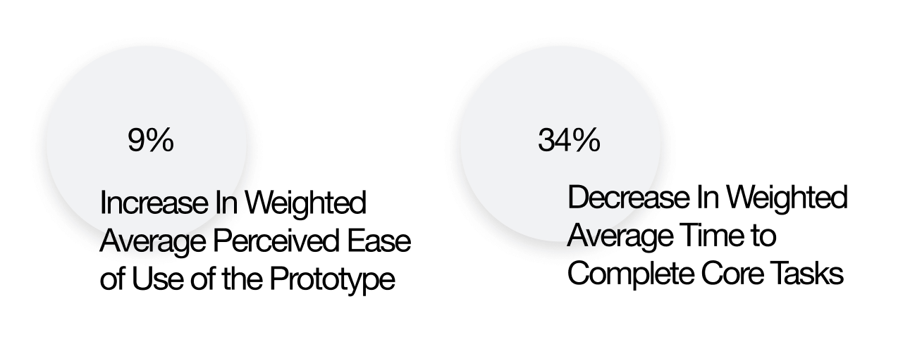
So how effective were our solutions? Here are our post design testing results...
We wanted to see differences in perceived ease of use and time of completion across articles, tours, annotations, and tools. We sought to compare the data from our baseline tests to a prototyped round of tests through a simple numerical analysis. A lot of users commented about the efficiency of the new tool. Some common words heard during the tests were “simple”, “easy”, and “intuitive” which was a great difference from our first round of research.
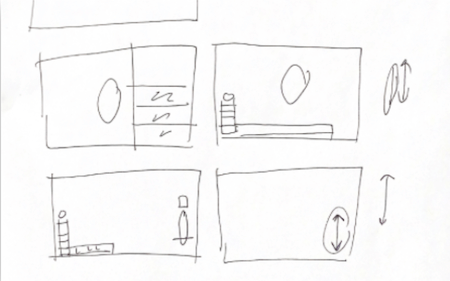
The iterations it took for us to reach our solutions...
As with any design process, we started off with paper sketching. After bouncing back and forth our ideas on layout, my partner Ben Decker and I played around with how we could effectively use space and balance to create a clear direction for users as well as keep the overall interface visually appealing. Here is the full timeline of our design iterations.
january
The Sketching Phase. Me and the other designers of the team continously sketched throughout the month of January. Much were very short sprints of ideas that mainly served to begin ideation and conversations surrounding our design issues.
february
The Wireframing Phase. As a team, we took the physical sketches that resonated with us the most and translated them digitally into wireframes. Much of this phase involved going back and forth from hand sketching to digital.
february
Medium Fidelity. We reached concrete agreements on concepts for our changes, and started to really play with layout through these new ideas. Of course, there was much going back and editing the concepts that just did not work technically for the design.
march
Here, we pretty much established the location and layout of all of our features. This is where we began to think heavily about aesthetics and user interface design. What kind of icons indicate the tabs most clearly? How big should our type and buttons be? What colors work best for this design?
march
Here, we're getting closer. But we're also seeing some things that are not working. Some of our user interface is established, but new discoveries and inspirations on how we can improve the user experience are sparked. Design is never a straight line.
april
The new ideas sparked in the previous phase are implemented. The user interface is heavily developed. For most of the time, we are focused on the interactive flow. This phase is very detail oriented and we have made sure to polish, check, and edit every part of the design.
To add more context to our solutions, here is an outline of our Research and Explorations:
In order to better understand the Voyagers’ current shortcomings, my team and I outlined a research plan which included conducting a competitor analysis, heuristic evaluations, usability testings, interviews, and field studies. The combination of these practices would allow us to see how the tool is currently being perceived by users, as well as gain feedback on how we can implement changes.
Competitor Analysis
Through examining other platforms with similar goals and interfaces, we were able to get insight on how we could successfully implement new features and update current ones to make the Voyager more accessible.


Our direct competitor is Nasa's Voyager. Through examining this platform, we gained insight on how reducing certain abilities to the user can potentially create a better learning environment.
An indirect competitor, the British Museum's Museum of the World website gave us additional perspectives on other ways one can learn about historical figures and items in an immersive, interactive manner.
Heuristic Evaluation
Each team member administered a heuristic evaluation individually. This allowed all of us to become familiar with the Voyager’s interface and begin conversations on the usability issues we saw ourselves.
Usability Tests
We approached usability testing by crafting a list of tasks that utilize the full functionality of the Voyager 3D platform. We then advertised our Zoom administered tests across social media as well as 12 volunteers from Usertesting.com. We completed a total of 24 usability tests.
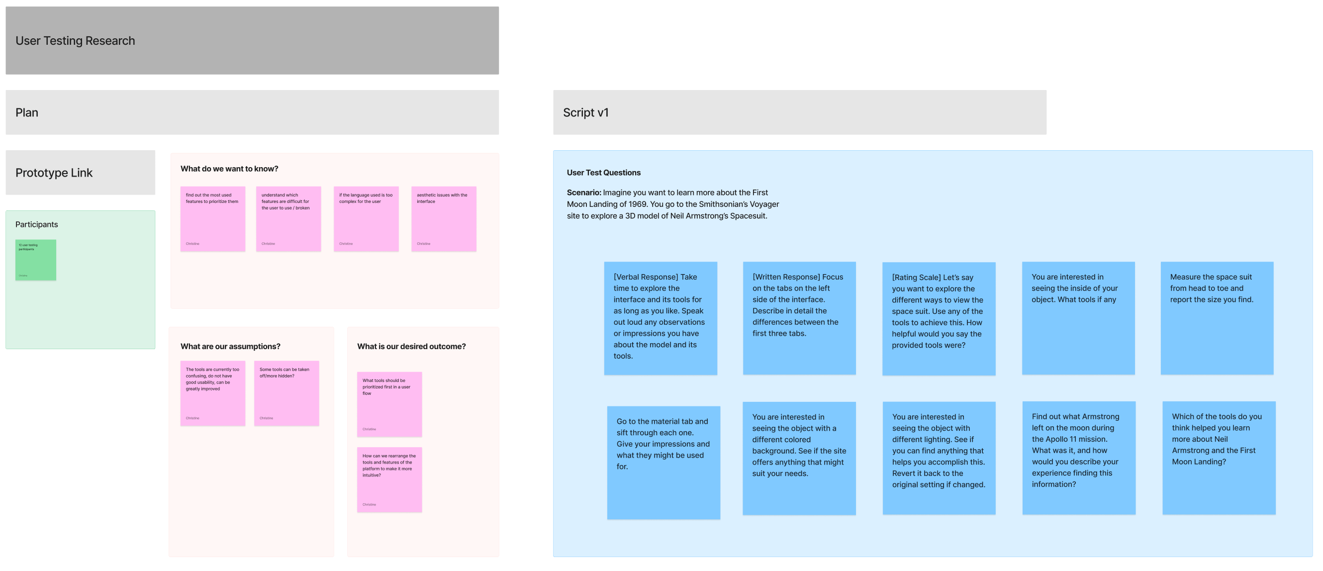
Interviews
We gathered over 10 educator and power user (participants familiar with 3D tools) interviews that helped provide the current attitudes towards the Voyager based on its ability to teach and overall usability of the 3D features.

Field Studies
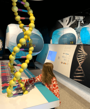
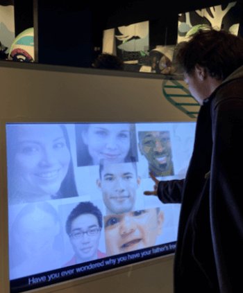
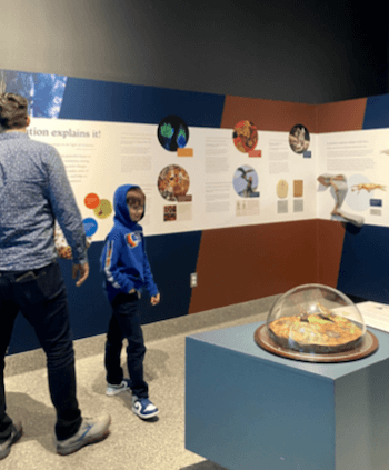
My team and I went the extra mile to gather information on how museum goers interact with technology in the physical space. This allowed us to examine how individuals were actively using the interfaces provided in similar contexts as the Voyager.
What we discovered through our Research Analysis...
Through these extensive explorations and research initiatives, we discussed the recurring themes and issues mentioned during this phase as a team. After hours of affinity mapping and meeting as a team, we listed the most concerning usability aspects and prioritized them on what should be changed during our design process.
Here are some extra assets from our Design Journey...
User Flow Mapping
After prioritizing our requirements, we began our design phase with an extensive user flow study. We mapped out the current flow of the Voyager and discussed what made sense and what didn’t. We utilized the feedback from our research to ideate ways to rearrange the flow to create the most seamless experience possible. It was difficult to approach the flow of this project since there are multiple points users could start from. However, we wanted to make sure each experience flowed from one to the next and was engaging enough to bring every user to utilize every tool and feature.

When we came to conclusion on how we wanted our user interface to look like, we established a Component Library:

Final Thoughts & Conclusion
In conclusion, my team and I are delighted with how far we have come to solve this problem. Our client, the Smithsonian, also expressed that they will slowly be implementing our changes. However, there are still many of our suggestions that we hope to see improved in the future, such as audio narrations for the visually impaired. Despite these hopes, I believe my team made great initial strides in redesigning an important platform to be more accessible for all to learn from. I would like to thank the Digitization Department at the Smithsonian Institution, specifically Jamie Cope, and my amazing teammates Arjan Guglani, Lexi Fogel, and Ben Decker.